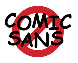
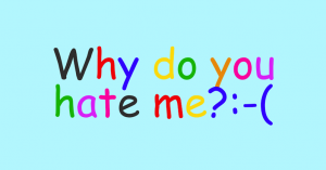
Comic Sans: Why do businesses still use this font?!
On this Children’s Day, let’s reflect on the font that looks like it was literally drawn by a child – Comic Sans. Despite its polarizing reputation, businesses worldwide still embrace this unconventional typeface. In this blog, we’ll explore its enduring allure and the reasons behind its persistent usage. Get your crayons ready for a typographic journey beyond the norm!
The Origins of Comic Sans
Comic Sans, designed by Vincent Connare in ’94, mimicked casual comic book handwriting. It started with teachers and kids loving its approachable vibes. Then, it took over unexpected spots like business presentations and official signs. How did it happen? Here are a few reasons:
Readability for Everyone
Comic Sans rocks for dyslexic or challenged readers. Its cool shapes and open counters make it easy on the eyes, even for those with visual impairments.
Friendly Feels
This font screams “chill” and “fun.” Some businesses use it to ditch corporate vibes and be warm and fuzzy. They want to feel like buddies, not snooty corps.
Blast from the Past
Comic Sans is an old-timer on the digital scene. Excessive use in the early internet days created nostalgia. Businesses ride that wave, hoping for positive emotions and an authentic throwback vibe.
What Comic Sans says about your brand:
 Comic Sans carries negative connotations within the design community. It’s seen as unprofessional, inattentive to detail, and aesthetically lacking. Consider the implications of using Comic Sans for your brand:
Lack of Visual Cohesion
It may undermine your brand’s consistency if you aim for a professional, sleek, or sophisticated image.
Perception of Amateurism
In certain industries, it can make you appear less trustworthy or competent.
Should we be less critical of Comic Sans? What we can learn from this childlike font:
Let’s approach Comic Sans with an open mind. Instead of dismissing it, we can draw insights from its usage and positive aspects:
Embracing Diversity and Accessibility
Celebrate its readability and accessibility for a broader audience, including those with reading difficulties.
Contextual Appropriateness
Consider the context. In informal settings or when playfulness is desired, Comic Sans might fit the bill.

My business uses Comic Sans. What should I do?
Oops, using Comic Sans for your business? Time to reassess! Here’s what to do:
- Get real about your brand: Does Comic Sans truly represent your desired image? Explore fonts that fit professionalism, sophistication, or innovation.
- Bring in the font gurus: Design professionals can guide you through the font jungle. They’ll help you find a font that matches your brand identity while keeping things readable and visually pleasing. Reach out to 1-Stop Design Shop for expert assistance.
- Time to experiment: Don’t be afraid to try different fonts! Let designers show you alternatives that are friendly and approachable without sacrificing professionalism.
- Baby steps: Ditching Comic Sans? Transition gradually to let your audience adjust. Ensure consistency across branding elements like your logo, website, and marketing materials.
Take a deep breath, gather your fonts, and make the change. Your brand deserves to look awesome. And remember, 1-Stop Design Shop is just a call away for font-astic assistance!

